

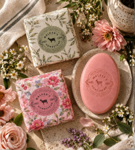
Building A Brand That Feels Handmade, Not Homemade.
Walker’s Homestead needed a visual identity that could carry the warmth of a small-batch, goat-milk product line while still feeling polished enough to compete on a retail shelf and online.
I developed the brand direction across identity, packaging, product presentation, and web design, creating one cohesive system that could move naturally from soap wrapper to lotion bottle to digital storefront.
Designed To Feel Collected Over Time.
The visual system leaned into botanical illustration, soft color variation, natural textures, and an established homestead sensibility rather than a single rigid packaging template.
Each product could have its own personality while still clearly belonging to the same family. The result was a brand that felt warm, tactile, giftable, and intentionally crafted.
Packaging That Works As A System.
I designed the packaging language to scale across multiple product formats, including soaps, lotions, hand care, and smaller specialty items.
Color, pattern, typography, labeling, and recurring brand marks created consistency without making every product look identical — giving the line enough flexibility to grow while remaining recognizable.
From Shelf To Screen.
The same brand direction extended into the website and e-commerce experience, where product discovery needed to feel just as thoughtful as the physical packaging.
I translated the warmth, color, and handmade character of the product line into a digital experience designed to support storytelling, product browsing, and purchase without losing the personality of the brand.
One Brand Across Every Touchpoint.
Walker’s Homestead brought together identity, packaging, product presentation, and web design into a consumer brand built to feel consistent whether someone discovered it online, received it as a gift, or picked it up from a shelf.